As well as messing around behind the scenes, I’ve made a few more visible changes to my site over the past week or so. My goal was to make it more like some of the other sites I enjoy reading.
Link posts
A common pattern I’ve seen recently is blogs that use two different kinds of posts: link posts and article posts. Link posts are for posting links to the other places, usually with some brief commentary, whereas article posts are longer-form articles written solely for that site. In RSS feeds, the link posts link directly to the destination, while articles still link back to the blog. This model seemed like a good fit for me. I’ve been posting links with commentary to Twitter, but find that format quite limiting. So I looked closely at two popular sites which follow this model: Daring Fireball and marco.org.
In the Daring Fireball feed, John Gruber indicates his article posts with a black star character (★) and everything else in the feed is a link. With link posts in the feed, the entries link directly to the remote sites and there’s a permalink at the bottom of the body, again indicated with a star. On the site, John uses different heading styles and dividers to help differentiate links and articles.

On Marco’s website and feed, links are indicated with an arrow (→) and articles have no special indicator. Marco also includes a permalink to link posts in the body of their entry in the feed, using an infinity symbol (∞) like on his site. With link posts on his site, he also uses a change of colour, with red underlined links used for the outbound title links. Black links with no underline are used for articles.

I preferred Marco’s solution overall, where links have a special indicator rather than articles. The underline on the links on the site also helps make them look more distinctive. However, I wasn’t totally sold on the symbol used by either of them. The star for DF is really part of the site’s brand, and not something I wanted to copy. Marco’s arrow was okay, but I thought that surely there is a Unicode character that better indicates a link.
Link post indicators
I spent a while looking for a good indicator icon for link posts and unfortunately I didn’t find a really good one. There is a Unicode character LINK SYMBOL (U+1F517) but that’s outside the base plane of Unicode characters, and therefore not very widely supported.
The option I liked best was the PLACE OF INTEREST SIGN (U+2318), which looks like this: ⌘. You almost certainly know it as the Command key icon on the Mac, but in fact it is also widely used as an indicator of tourism “places of interest” in certain European countries. Susan Kare, the designer on the original Macintosh team, started using the symbol after seeing it in a Swedish campground. The symbol is more generally known as either a Bowen knot or “St John’s Arms”.
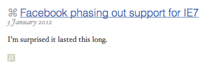
So link posts on this site look like this:

Clicking on the blue link will take you directly to the article I’m linking to. I copied Marco’s example of using my site’s link colour for the title of link posts, and underlining them to indicate the link
You can see the place of interest symbol (⌘) indicating that this is a link. It appears as a prefix to the post title on the website, but part of the entry title in the feed. I’m hoping that this character has fairly widespread font support – I know it is available in Arial Unicode on Windows and by default in several fonts on the Mac.
The little icon at the bottom takes you to the link post itself on my site. This link is intentionally small and unobtrusive because you typically won’t need it for anything. The icon itself is a new site logo I put together quickly. If you read my blog in a fancy feed reader like Reeder for iPad, you should see the new logo in a high resolution as the feed icon in your client.
No more comments
I’ve removed comments from the site because I didn’t find them adding much value in recent months. While they don’t require a lot of work to just maintain, the code was getting crufty and difficult to enhance as I made other changes. It seemed like a good time to try simplifying things and get rid of them. If you need to get in touch with me about something I’ve written, please just send me an email.
I’m sure these changes will be a little bit confusing and weird to start with, particularly if you don’t read any other blogs in this format. But I hope it will help in the long term to allow me to post more interesting things in a way that’s easy to consume.
